FROM CONCEPT TO REALITY
Overview
Flying Machine helped carry over a "Help me, I've fallen and I can't get up" brand from the 1980's over into the 21st century. As aging boomers started looking for more stylish alternatives for the trusted medical alert and call center package, we recognized that the language, tone, visual identity and overall design of the product and brand play a role as important as the actual life-saving service it offered. Everything from the brand name, through the product design and supporting communications, was created with the promise of a loyal helper that affords confidence and style alongside trust and technological edge.
Naming
We looked for a name that would be easy to pronounce. Something that rolls of your tongue while making you feel you're in good company. We looked into all sorts of cultural references from the 60's and 70's but eventually settled on one of the top ten dog names. And just like that, Tucker was born. In addition to the name itself, we went after the dated terminology and replace "medical alert" with a "personal emergency response system", or PERS.
Logo + corporate identity
The visual identity married several key symbols: Tucker's uppercase "T", the ubiquitous EMS Star of Life that anchored the brand in life-saving care, and the 3-dimensional coordinates grid supporting the "Go bravely" moto. The saturated blue-gray-white palette feels fresh and contemporary while projecting a sense of calm and control.
The Tucker logo is an evolved Avenir Next typeface and the resulting collateral and corporate identity featured a bold minimalist look.
Website
The clean parallax website offered a 180º departure from traditional medical alert websites. We focused on conversion as we cleaned up unnecessary text and replaced outdated and poor-quality imagery with aspirational photography and overall design that's closer to a smart watch than to a medical device.
We complemented the minimalist product photography and lifestyle shots with original illustrations that helped in conveying the product's unique benefits.
Product design
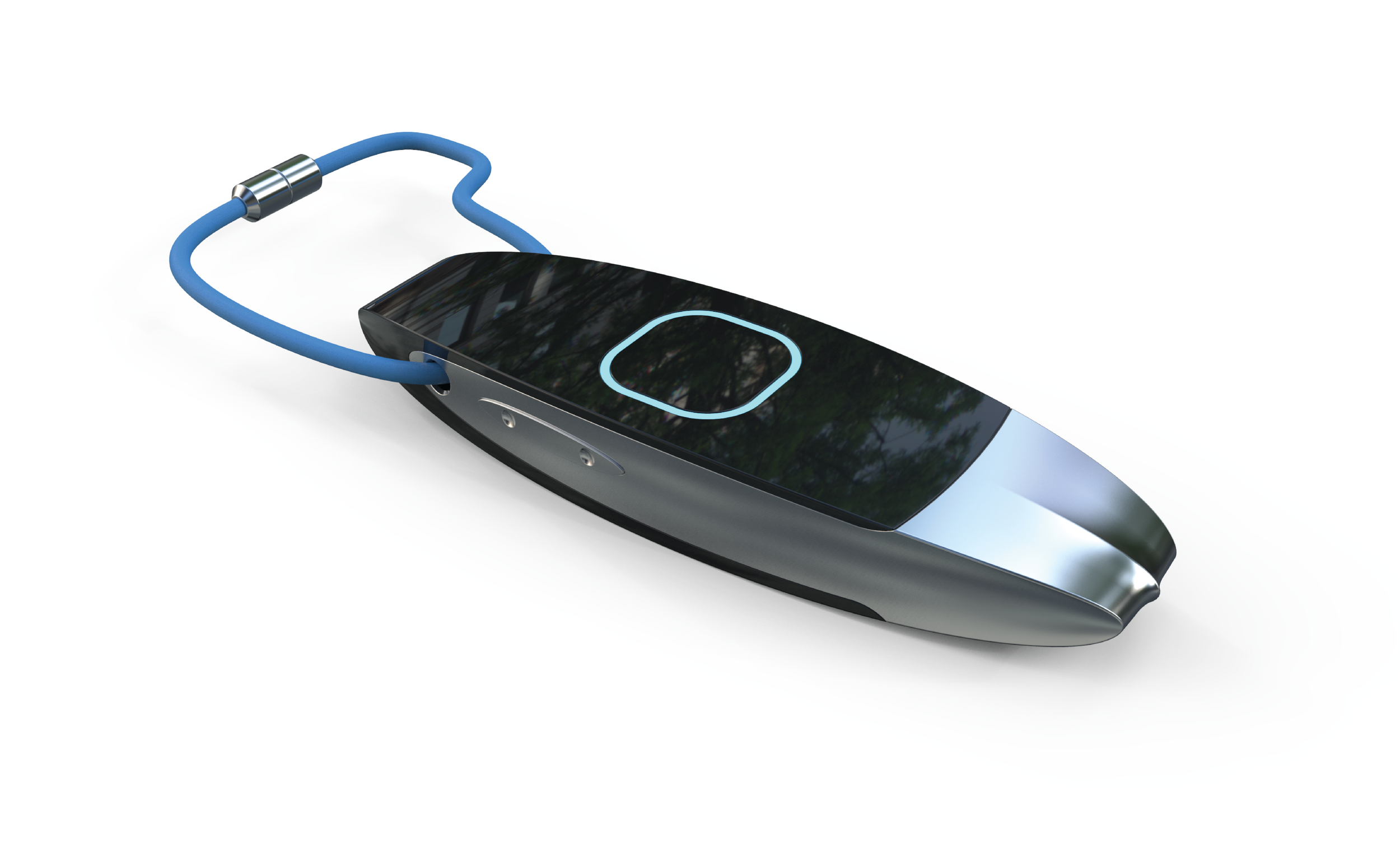
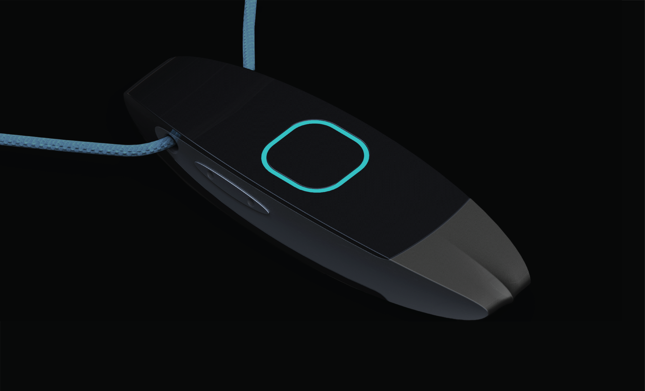
Our goal was to truly stand out and make Tucker customers feel like they were wearing a stylish, quality gadget. We insisted on streamlining the internal components before looking to the outer design, which gave us the freedom to rethink the casing altogether. Our industrial designer had just finished designing an Italian sports car so it was only natural to let it inspire Tucker’s aluminum shell. Evocative of key-less luxury car remotes, the free-flowing easy-to-hold shell features a cool blue light around the emergency button that makes it stand out clearly without resorting to the traditional red plastic of the past century. The final design was flexible enough to be worn as a pendant, on a key-chain, or around the wrist like a futuristic fit-bit.